Introduction to block fonts
Block fonts are everywhere, even if you have never stopped to name them. They show up on storefront signs, sports jerseys, posters, YouTube thumbnails, school projects, and even industrial labels. They feel strong, clear, and impossible to ignore. When you see thick, squared letters with confident edges, chances are you are looking at a block font doing exactly what it was designed to do: grab attention and communicate fast.
What makes block onts so interesting is that they sit at the intersection of function and style. They are not just decorative typefaces; they are tools built for clarity. At the same time, they carry a certain attitude—bold, direct, and sometimes nostalgic. Designers use them to signal strength, reliability, or a retro vibe, depending on the context.
In this guide, we will take a deep dive into block fonts from an expert perspective while keeping things casual and easy to follow. We will explore what they are, where they came from, how they are built, where they work best, and how you can use them effectively in your own designs. By the end, you will not only recognize block fons instantly but also know exactly how and when to use them.
Let’s break it down step by step.
What Are Block Fonts and Why They Matter
Block fonts are typefaces characterized by thick strokes, simple shapes, and a strong geometric or rectangular structure. Most letters look as if they were built from solid blocks or slabs rather than delicate lines. They often have minimal contrast between thick and thin strokes, which gives them a sturdy, uniform appearance.
The defining quality of block fonts is readability. Because the letters are bold and uncomplicated, they remain legible even from a distance or at small sizes. This makes them ideal for headlines, signage, and anything that needs to be seen quickly. You rarely see a block font used for long paragraphs of text, but you constantly see them used for titles and labels.
Another reason bloc fonts matter is psychological impact. Thick, squared lettering feels strong and dependable. It communicates authority without trying too hard. Brands that want to appear trustworthy or powerful often choose block-style typography because it subconsciously signals stability and confidence.
From a design standpoint, block onts also help create hierarchy. When you place a block font headline above lighter body text, the contrast immediately guides the reader’s eye. This simple trick is one of the oldest and most effective layout strategies in graphic design, and block fonts play a key role in making it work.
The History and Evolution of Block Fonts
Block fonts did not just appear out of nowhere. Their roots go back to early printing and signage, when legibility was more important than elegance. Printers and sign painters needed letters that could be read from a distance and carved or painted quickly. Thick, straightforward shapes were the natural solution.
In the 19th century, slab serif and wood type fonts became popular in posters and advertisements. These early “blocky” letterforms were used to shout messages on city streets. Circus posters, railway announcements, and storefront signs relied on heavy, bold type to stand out in crowded environments. These were some of the earliest ancestors of modern block fonts.
As the 20th century progressed, block onts became tied to specific cultural moments. Think of varsity lettering on college jackets, military stencils, and industrial labeling. Each of these styles used chunky, no-nonsense letters that were both practical and symbolic. They represented strength, teamwork, and durability.
Today, block fonts have evolved into both classic and digital forms. Modern designers have refined them with smoother curves, cleaner edges, and better spacing. Yet the core idea remains the same: bold, simple shapes that communicate instantly. Even in a world of sleek minimalism, blok fonts still feel relevant and timeless.
Key Characteristics That Define Block Fonts
The first thing you notice about block fonts is their weight. They tend to be bold or extra-bold, with thick strokes that create a heavy visual presence. This thickness is what makes them so effective for headlines and signs, as the letters refuse to fade into the background.
Another important characteristic is their geometric construction. Many block fonts rely on straight lines, right angles, and simple curves. The letters often look as if they could be drawn with a ruler and a few basic shapes. This gives them a clean, structured feel that contrasts nicely with more decorative or script typefaces.
Spacing also plays a big role. Block fots typically use generous spacing between letters to prevent them from feeling cramped. Because the strokes are thick, tight spacing would make the text hard to read. Good block fonts balance boldness with breathing room, keeping everything clear and organized.
Finally, block fonts usually minimize decorative details. You will not see many flourishes, swashes, or complex serifs. Instead, the focus is on clarity and strength. Every part of the letter has a purpose. This simplicity is what makes block fons so versatile and easy to use across different mediums.
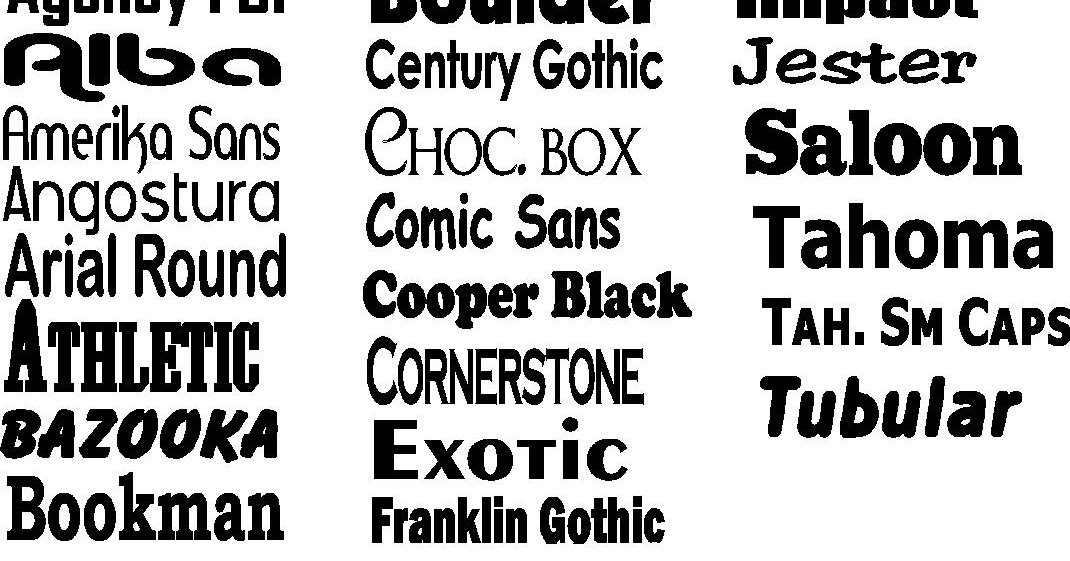
Popular Types and Styles of Block Fonts
Not all block fonts look the same. In fact, there are several distinct styles that fall under the block font umbrella. Understanding these variations helps you choose the right one for your project rather than just picking the boldest option available.
Slab serif fonts are one common type. These fonts have thick, rectangular serifs that look like little blocks attached to each letter. They combine traditional serif structure with heavy weight, making them feel both classic and strong. They work well in editorial headlines and posters.
Sans-serif block fonts remove the serifs entirely, focusing on pure shapes. These tend to look more modern and minimal. They are popular in tech branding, sports graphics, and social media designs where a clean, contemporary feel is important. Their simplicity makes them extremely versatile.
Stencil and industrial block onts form another category. These often include gaps or cutouts in the letters, mimicking spray-painted or stamped text. They bring a rugged, utilitarian vibe that is perfect for military, warehouse, or street-style aesthetics. Used carefully, they add personality without sacrificing readability.
Where and How Block Fonts Work Best
Block fonts shine in situations where visibility is critical. Large headlines, banners, and billboards are perfect examples. When someone only has a few seconds to read something, thick, bold letters make the message unmistakable. This is why event posters and sale signs frequently rely on block fonts.
They also perform exceptionally well in branding. Logos that use block fnts often feel stable and dependable. Think about construction companies, gyms, sports teams, and hardware brands. The heavy lettering reinforces the idea of strength and durability, aligning the typography with the brand’s message.
Digital design benefits from block fnts too. On small screens, thin or delicate typefaces can disappear. Block fonts maintain their presence even on mobile devices. This makes them ideal for app titles, thumbnails, and call-to-action buttons where clarity is non-negotiable.
However, they are not meant for everything. Long paragraphs set in bloc fonts can feel heavy and tiring to read. The key is to use them strategically—headlines, short labels, or highlights—while pairing them with lighter fonts for body text. Balance is what keeps the design effective.
Tips for Choosing and Using Block Fonts Like an Expert
The first rule is simple: do not overuse them. Because block fonts are visually loud, using them everywhere can overwhelm your layout. Instead, treat them like a spotlight. Use them to draw attention to the most important parts of your design and let everything else support that focus.
Pay close attention to contrast. Pairing a heavy block font with a thin or regular-weight typeface creates visual hierarchy and makes your design easier to navigate. This combination feels intentional and professional rather than chaotic. Good typography is often about contrast, not uniformity.
Consider the personality of the font. Some block fonts feel playful and retro, while others feel serious and industrial. Always match the font’s tone to your message. A fun kids’ poster and a corporate annual report should not use the same style of block lettering. Context matters more than trend.
Finally, test readability in real conditions. Zoom out, shrink the size, or view your design on different devices. A block font that looks great on your screen might feel cramped or awkward elsewhere. Professional designers constantly test and adjust until the type works perfectly in every scenario.
The Future of Block Fonts in Modern Design
Even as design trends shift toward minimalism and sleek interfaces, block fonts are not going anywhere. In fact, their clarity makes them more useful than ever. In a world overloaded with information, bold and simple lettering cuts through the noise better than anything else.
Modern typography tools have also opened new possibilities. Designers can now customize blok fonts with variable weights, rounded corners, or subtle textures. These small tweaks keep the style fresh while preserving its core strength. It is easier than ever to create a unique look without sacrificing readability.
Block fonts are also thriving in digital and social media culture. Thumbnails, memes, and short-form videos rely heavily on big, bold text to grab attention instantly. The same principles that worked for old street posters now work for smartphone screens. The medium has changed, but the need for clarity remains the same.
Ultimately, block fonts endure because they solve a universal problem: how to make text seen and understood quickly. Trends will come and go, but that need will never disappear. As long as designers value clarity, block fnts will always have a place at the table.
Conclusion:
Block fonts may look simple, but there is a lot of thought behind them. They combine history, psychology, and practical design into one powerful tool. From vintage posters to modern apps, they continue to prove their worth across every medium.
When used thoughtfully, blok fonts can transform an ordinary design into something bold and memorable. They create hierarchy, strengthen branding, and ensure your message gets noticed. The trick is knowing when to use them and when to step back.